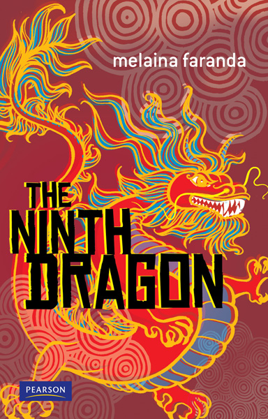
The Ninth Dragon

Ninth dragonThis cover was great fun to design, aided by frills such as gold foil and embossing. The dragon was drawn freehand, then coloured. Layered offsets were made of it in a couple of colours to give it a feel of old print. I also finally found the perfect use for a font I have long loved: Chinese Rocks.

A historical novel which begins at an archaeological dig in China where Zach’s mum has landed a job at a nearby museum. Zach joins her there most reluctantly for the holidays, but once he has found a mysterious carved jade dragon at the dig, life turns very strange indeed.

Cover and text design + ten full page b/w illustrations + scattered small llustrations

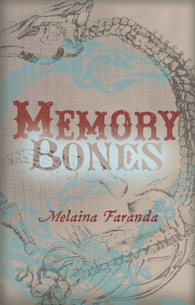
Memory Bones

memory bonesMemory Bones


This historical novel for early teens focuses on the early life of Mary Anning (thought to be the inspiration for the tongue-twister ‘she sells sea shells by the sea shore’). Mary scours the coastline and cliffs near Dorset in search of fossils that she can sell to feed her impoverished family. She makes a historically significant discovery …

This cover features an aged linen texture and muted tones to enhance the themes of poverty and loneliness. The skeleton of the ichthyosaur (fish-lizard) is embossed.

Cover and text design + 13 monotone watercolour illustrations + scattered small illustrations

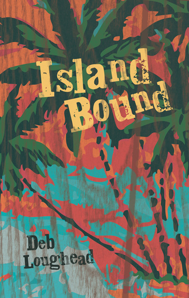
Island Bound

Island boundIsland Bound


This story for early teens is based in Bermuda, so the design adopted a laid-back wood-grain-with-peeling-paint look.

A story of displacement and coming to terms with it, with a mystery at the centre.

Cover design and illustration + 16 b/w internal illustrations

The Intruder

IntruderThe Intruder


A futuristic tale for pre-teens. Luca is the sole occupant of Moon Base, where a secret mineral has been found to produce bumper crops of food for Earth, grown under giant domes. Luca is there day in, day out, supervising the computerised supply chain. But then Luca’s lonely world is disrupted by an unknown intruder. The question is, friend or foe?

Cover design and illustration, plus 16 black and white collage chapter illustrations

Those blue tendrils on the cover are foil – cool!

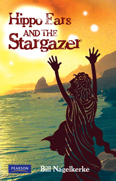
Hippo ears

hippo ears

Hippo Ears and the Stargazer


A pre-teen historical novel. I chose an silhouette illustration style borrowed from Grecian urns for the cover and internal illustrations.

Hippoarchus and his sister Sappho listen to enchanting stories about the stars, the sun and the Earth from their friend the Stargazer. But some feel his stories are dangerous. He must be warned before it is too late….

Cover design and illustration + 10 full page internal illustrations + small scattered illustrations

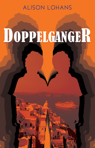
Doppelganger

doppelgangerDoppleganger


Something about the title inspired me to go for a 70’s feel for this cover. The burnt orange reflects the heat of the Greek Islands, where this coming-of-age story for early teens is set. Connor is spending his Easter holidays on a cruise with his mum and very annoying little sister to the Greek Islands and Turkey. Lucky he has his computer game Doppleganger with him to while away the time. But he seems to have become very unpopular with the crew and his fellow passengers. Could it have anything to do with the boy he glimpsed, wearing his favourite soccer shirt? The boy who looked exactly like him?

Cover design and illustration + 14 black and white photographic collage illustrations

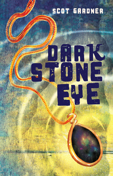
Dark Stone Eye

dark stone eye Dark Stone Eye


A horror story and a love story at the same time. 12 year old Ben’s Nanna has told him of the mysterious jewel that looks like a dark eye – and the powerful effect it has on all who have owned it – many times. As the stone in the story makes its way around the world, you never know where it may end up.

This cover design is opalescent with a hint of the sinister reflected in the typography.

Cover design and illustration + 14 black and white photographic collage illustrations


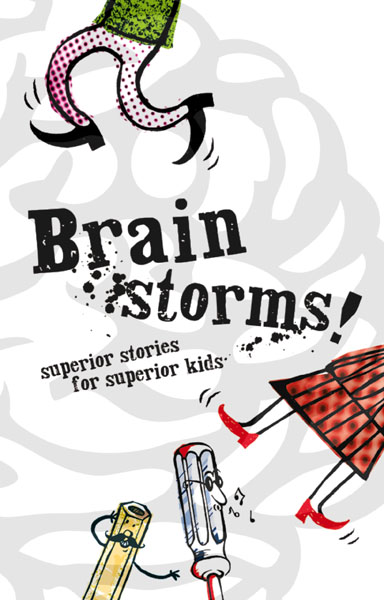
Brain Storms!

Brain Storms!


One of the most enjoyable jobs I’ve had so far. This book showcases writing by kids for kids, aimed at the primary age group. These fantastic short stories are some of the finalists from the Nestlé ‘Write Around Australia’ competition, run between 1994 and 2005. Each of these young authors were mentored by an Australian children’s author, who helped them to polish the work into a final draft. The design brief was completely open, so I chose to emphasise the humorous and surprising aspects of many of the stories. The grey watermark of the brain on the cover represents a spot UV varnish.

Cover design and illustration + 11 double-page black and white internal illustrations + smaller illustrations scattered throughout.


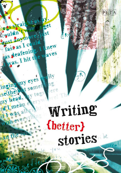
Writing Better Stories

writing (better) stories

Writing Better Stories

This book for teachers is all about freeing up creativity in kids. How to inspire everyone in the class at the same time? Consequently, it felt like the only right approach to designing this cover was to be totally free. The base image on the cover is of a favourite indoor plant of mine – used to convey the explosion of ideas. Collage elements were added, including samples of kids’ text with editors marks. I had lots of lovely feedback from the client and colleagues on this cover design, and I’m sure it was because the fun I had with it was evident in the final result.