Stand Up! (internal pages)
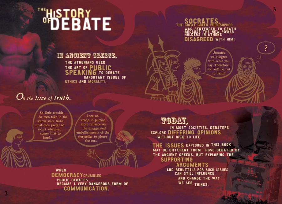
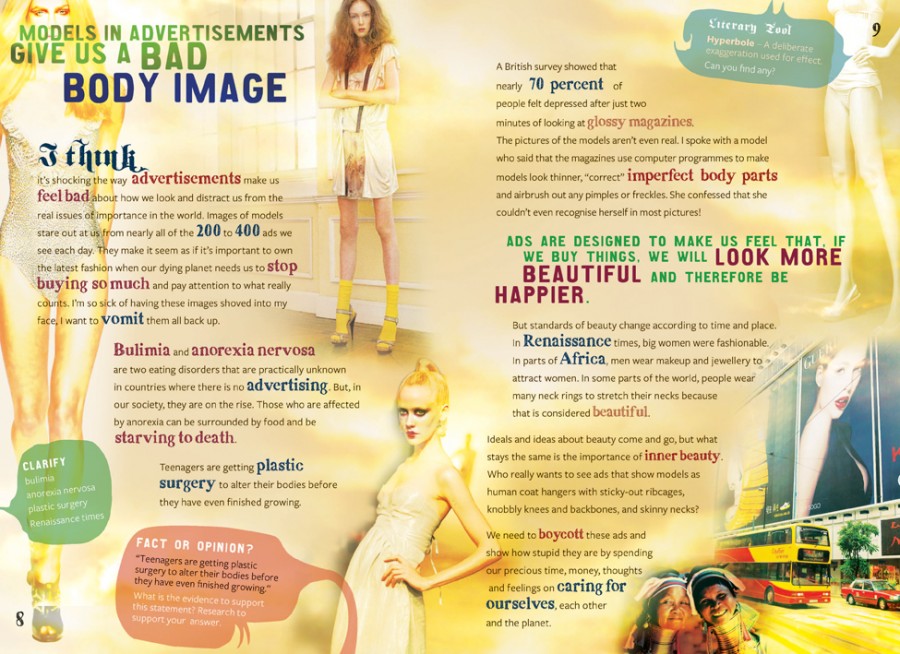
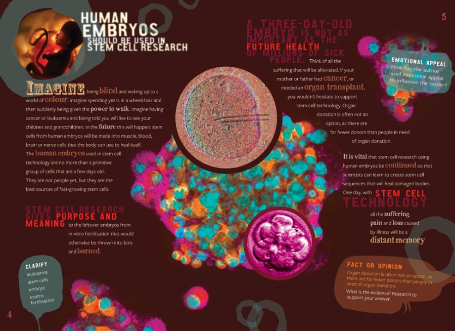
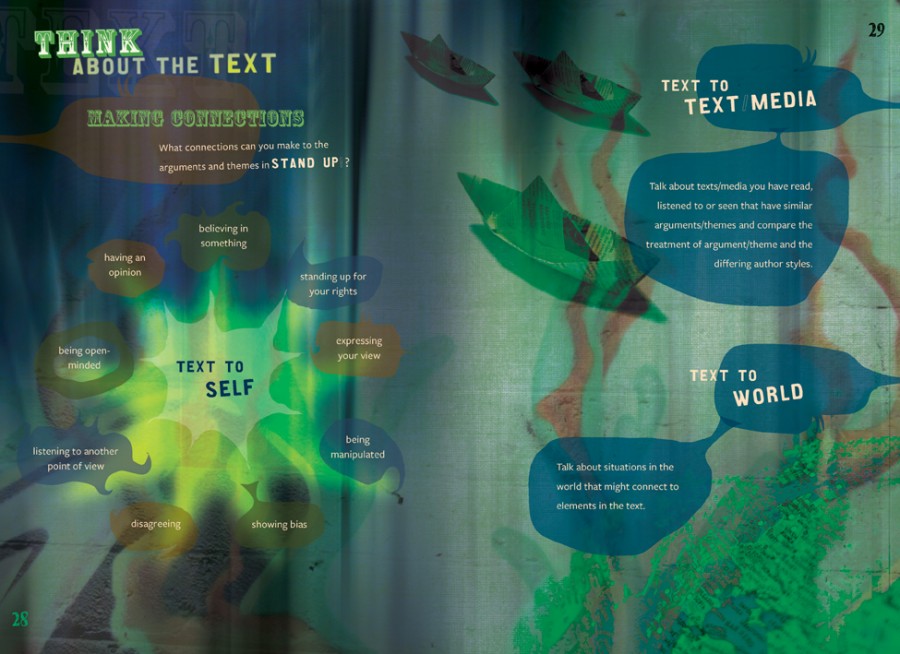
Stand Up! (internal design) OK, now for some internals. These were a joy to work on – 32 pages in full colour, with a very open brief. For each issue tackled in the text (for example, Global Warming), there is a ‘for’ and an ‘against’ spread – each designed to be as persuasive as possible with emotive images. The student is challenged to see past all this persuasive stuff and identify the truth. We aimed to make every spread very different from the last, with lots of surprises and a bit of chaos balanced against usability. See what you...
Read MoreStand Up!
Stand Up! I loved working on this. Stand Up! is a book aimed at early high school students, and it encourages students to analyse and question the written word and highly polished or emotive images to discover the true message therein. This group of kids are so accustomed to slick visuals wherever they look, so we went for a zine feel with loads of layers and textures and organised chaos throughout! I did the cover and internals, plus illustration where...
Read MoreThe Crystal Crescent
The Crystal Crescent A sci-fi novel for pre-teens. This cover features my first crack at outer space! The future looks grim, the ozone layer has been destroyed and earth is at risk. Raki and Tando are on a mission to find a source of the rare substance telotion, which when heated creates masses of ozone. Cover and text design + 10 full page b/w illustrations + scattered small...
Read MoreMy Summer of the Lions
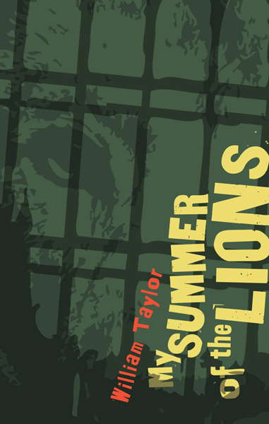
My Summer of the Lions The first book I designed for Pearsons NZ. This novel for pre/early teens deals with some heavy stuff – the loss of his mother and an emotionally absent dad lead Martin into the wrong company, until he discovers friendship in the unlikely form of a pair of ageing zoo lions. The cover needed to look dark and edgy, but tinged with hope. Cover + text design + 16 internal b/w...
Read MoreThe Ninth Dragon
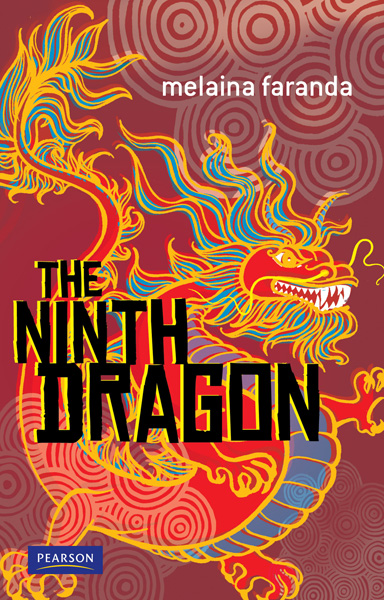
This cover was great fun to design, aided by frills such as gold foil and embossing. The dragon was drawn freehand, then coloured. Layered offsets were made of it in a couple of colours to give it a feel of old print. I also finally found the perfect use for a font I have long loved: Chinese Rocks. A historical novel which begins at an archaeological dig in China where Zach’s mum has landed a job at a nearby museum. Zach joins her there most reluctantly for the holidays, but once he has found a mysterious carved jade dragon at the dig, life turns very strange indeed. Cover and text...
Read MoreMy first 350 words
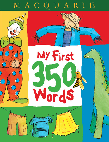
My First 350 Words A fun, colourful book for preschoolers with beautiful large illustrations for 350 first words. Cover and internal design
Read More