The ugly e-book!

Good typography and cover design – how important is it to the e-book reader?


This article from WIRED magazine highlights some concerns that I’ve long held about our new digital world of ebooks. In particular, the loss of the wonderful art of the typographer, not to mention a well-designed cover. Let’s hope that developers are onto it!


http://www.wired.com/gadgetlab/2009/05/e-book-design/

fisheye now does eBooks!

So here’s what you’ve been waiting to hear:

Fisheye can now publish eBooks! We can produce ePub (eg, for iPad) or MOBI files (for Kindle), using the latest InDesign suite of tools. We can either create eBooks from scratch for you, or convert existing digital files to ePub/MOBI format. Easy! Give us a call on 0421 865 843 with any eBook queries you may have.

the fisheye blog

Hello and welcome…

Firstly I’d like to tell you a bit about what to expect here. I will hopefully add new post once a week, and it could be about anything design-art related. It could also be about the vintage chair I’m learning to reupholster, something inspiring I saw or read, something I’m enjoying cooking, or something that I thought you’d find funny. Sometimes it might even be about book design. I would love your feedback of course.

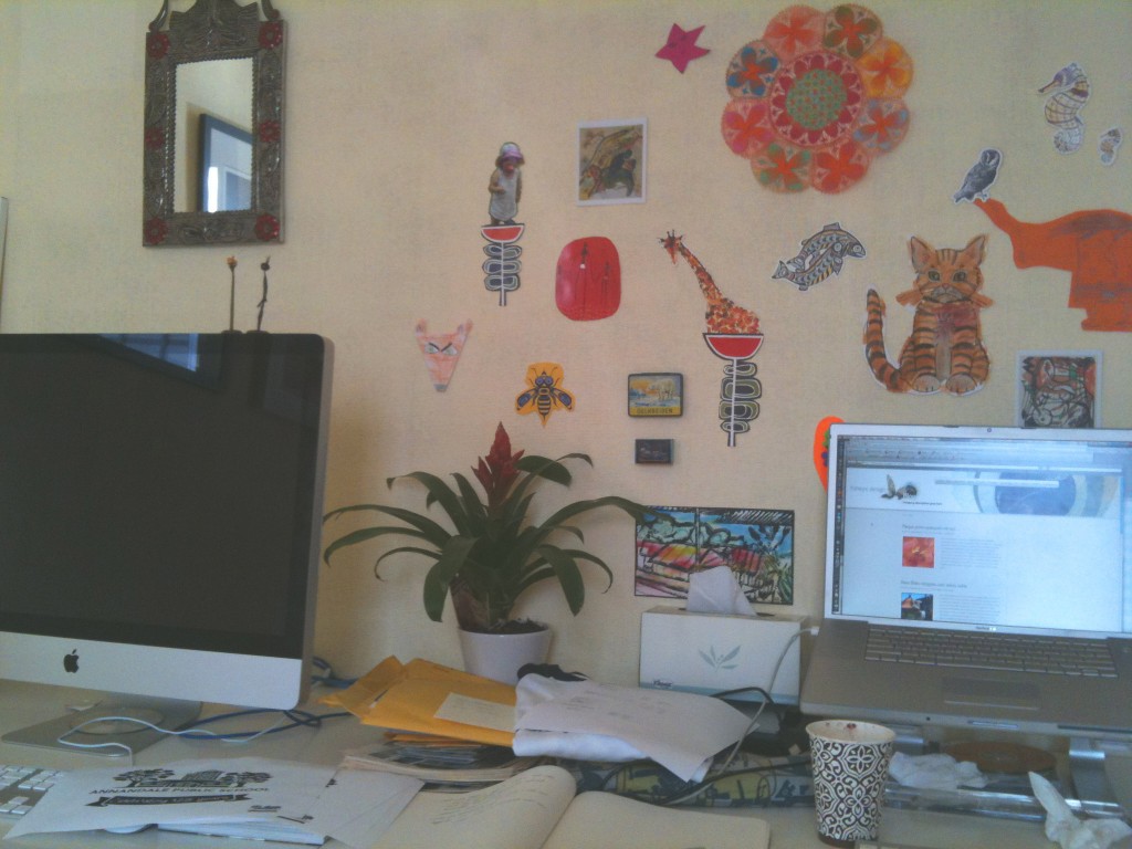
In our office I’m creating a wall of interesting bits designed to distract me in a positive way, if that makes sense. Here it is. As I find things up they go. Among them presently is a favourite multicoloured doily (thanks for that one Jo), a cat I copied from one of my daughters picture books (The Cat with No Name), and a drawing from my son’s Spongebob period (ongoing). It’s a poor photo, complete with old coffee cup, might post some details of the wall using my camera instead of my phone 🙂 Bear with me as I learn more …


The Tree of Life – movie review

The Tree of Life – movie review


Well. I’m glad I’ve had a few weeks to let this one stew. I mentioned I was going to see this movie having heard both rave and damning reviews. I am certainly glad I was warned of how ambitions the project was. An obvious stylistic comparison for me was Kubrick’s ‘2001: A Space Odyssey’. Long dreamy passages with no dialogue and cosmic explosions … However, ‘The Tree of Life’ takes it much further and for me, was an emotional experience. Perhaps as I’m a mum I react more extremely to a story of a mother’s loss. The remaining son’s dichotomous relationship with his remote father and seemingly perfect mother, compounded by the tragic loss of his brother, coupled with the dreamy retro-lit sequences of the family outside, made it a memorable movie for me. My only criticism is that some of the sequences of the cosmos/volcanoes/clouds/marine life went on too long and seemed ultimately self-indulgent. There were a few snorts and even a few walk-outs during these episodes at my cinema (Dendy, Newtown, so you’d expect an open-minded crowd). All up, I’d recommend it.

4 stars

Stand Up! (internal pages)

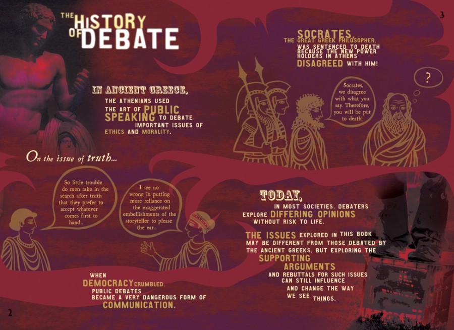
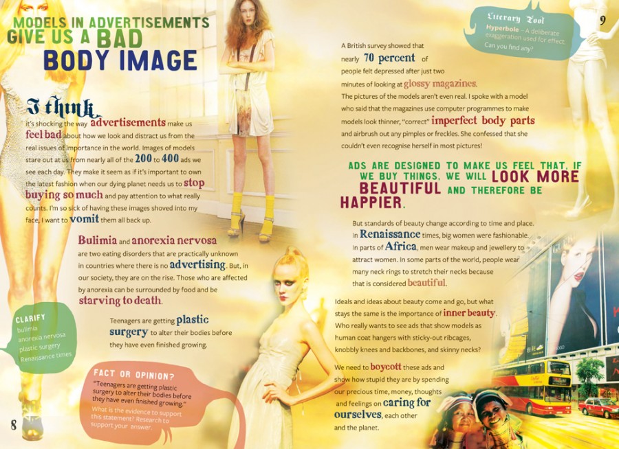
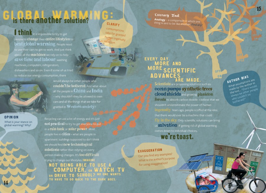
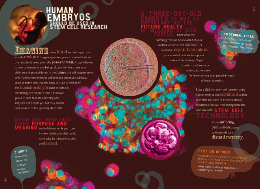
Stand Up! (internal design)

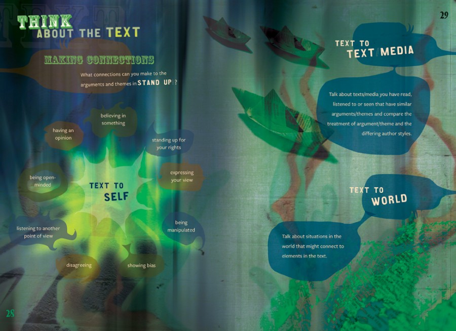
OK, now for some internals. These were a joy to work on – 32 pages in full colour, with a very open brief. For each issue tackled in the text (for example, Global Warming), there is a ‘for’ and an ‘against’ spread – each designed to be as persuasive as possible with emotive images. The student is challenged to see past all this persuasive stuff and identify the truth. We aimed to make every spread very different from the last, with lots of surprises and a bit of chaos balanced against usability. See what you think.